It has finally come! Lonny, the new online design magazine that I'm hoping will fill the void in my heart left by Domino Magazine, is finally up and online!
I'm looking forward to checking it out while my husband catches up on an old episode of Entourage.
*UPDATE*
Just did a quick perusal. I'm in love. From the gorgeous photography, to the great graphic design and stylish vibe, it's fantastic. I particularly love the apartment of Design*Sponge blogger Grace and the gardens of the former editor of Domino. And particularly amazing is the fact that there are links when you hover over an ad or item that you like... click on the ad or item, and you are magically linked to their website! Off to bed - and looking forward to taking a closer look at it tomorrow!
|
|
|
|---|
Wednesday, September 30, 2009
"Take a moment . . . "

"Razzle Dazzle" from Benjamin Moore
Greetings all,
As much as we all feverishly look through each new magazine for the hottest trends - there are more important things than a dramatic, new paint colour.


More important than a candy pink Mini Cooper.


Or a simple arrangement of a dozen roses.

And that is your health.
October 1st marks the beginning of Breast Cancer Awareness month. Take a moment and be well informed about the facts. Click here for more information on screening, treatment, and donations. Click here for more information on the Susan G. Komen Foundation.
Be well,
tartanscot
also check out my friends - beach bungalow 8, Mrs. Blandings, Easy and Elegant Life, Cote de Texas, and Pigtown Design for more thoughts on Breast Cancer Awareness month.
There Goes The Neighborhood...
A few weeks ago I looked out from the window to see this staring back at me:
One of the most basic tenets in microeconomics is de gustibus non est disputandum (there's no accounting for taste). And yet, I still can't help but shake my head in wonder. Who on earth thought that red brick, yellow stucco and white stone would work well together? I believe this is one of those examples of more being just way too much.
Fortunately though, there are two empty lots between us and them and in but a few short years (perhaps even less), I won't have to look at it. After all, even if I advocate a live and let live attitude towards design, I can't help but feel a bit disappointed that I also have to live with it.
Ads that are Rad
Sometimes I derive more inspiration from ads in the design magazines than from the magazines themselves...
LOVE this Nancy Corzine ad - a great sectional (that doesn't look like a man-couch), a great Chippendale-chair-filled dining nook, gorgeous pendant lighting and an amazing view :)

LOVE this Nancy Corzine ad - a great sectional (that doesn't look like a man-couch), a great Chippendale-chair-filled dining nook, gorgeous pendant lighting and an amazing view :)

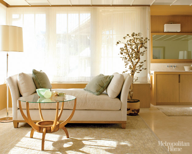
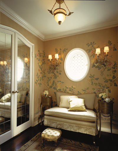
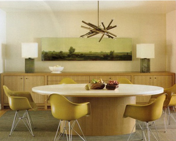
Infusing Yellow in Your Color Scheme and Interior Design by Amanda Nisbet


In this stunning living space Nisbet pairs golden yellow with neutrals and accents of teal and melon. Yum! Various shades of yellow are picked up in the room's walls, console table, throw pillows, draperies and accessories.


Nisbet creates an upbeat modern white and raspberry girl's bedroom with bright accents in citron yellow, turquoise and orange. It's darling. Notice how she consciously places bits of yellow throughout the room, but not next to each other.


Pair the garden stool with accessories like this handmade, glazed ceramic Double Yellow Parrots to repeat the accent color. These darling feathered friends would look fabulous atop a contrasting side table, but would get lost if near or on the garden stool in the same hue.


An upholstered chair is always a great place to add an accent color.


Nisbet creates a sunny breakfast nook by painting the walls and upholstering the bench and chairs in citron yellow. Love those lucite chairs!

Which of the cheeful rooms designed by Amanda Nisbet is your favorite?
*images from Amanda Nisbet, Pieces, Tonic Home, Mitchell Gold and Bob Williams, Duralee, Decorati
Tuesday, September 29, 2009
Quiet Indulgences
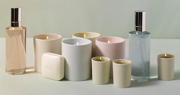
My favorite form of shopping therapy has always been purchasing perfumes and candles. There's just something about a gorgeous scent that's pure escapism. And just as relaxing, while there are certainly some pricey fragrances available on the market, these small indulgences don't have to be a big hit to my budget.
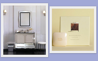
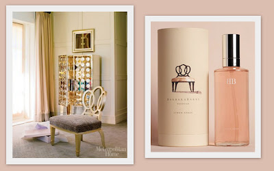
Right now, I'm enjoying designer Barbara Barry's home fragrance collection, which comes in four unique scents designed to suit four separate rooms in your house (powder room, dining room, bedroom, and living room. It also doesn't hurt that all of Barry's products are gorgeously packaged and feature Barry's own watercolors of her own furniture (including the amazing bracelet chair). My favorite product is the bedroom linen spray which is a wonderfully soothing combination of vanilla and nutmeg. The scent instantly perks up my sheets, even if they aren't straight out of the dryer.
Prices range from $30 to $34, which is a steal considering the sheer enjoyment I get from Barry's scents. And so, while I may not be able to afford Barry's scallop pendant that I've been coveting (let alone her design services!) for the cost of a dinner out I can add just that extra little something to my bedroom (or powder room or living room...).
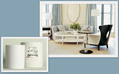
While I'm at it, here are a few more gratuitous shots of some of Barry's design work. While Barry is an unapologetic devotee of neutral color palettes, her use of textures, an interesting mix of modern and traditional design and bold shots of metallic make her rooms far glamorous and very, very rich.

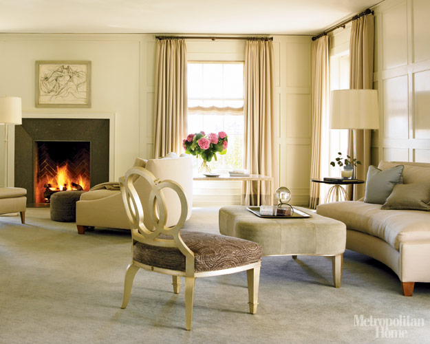
Photographs courtesy of Metropolitan Home and Barbara Barry.
Green with Oly Envy
In the most recent Elle Decor, I read about the opening of Oly Atelier - an outpost in Manhattan of one of my all-time favorite furniture companies... While I'm very happy for them, I'm a little bitter that they didn't decide to open their first showroom out here in LA.
Look at all this gorgeousness!


 Reason #436 for me to make another visit out to NYC soon!
Look at all this gorgeousness!


 Reason #436 for me to make another visit out to NYC soon!
Household Cleaning Tips and Chic Housewares From Alice Supply Co


What is next on your housecleaning chore list?
*images from Alice Supply Co.
"All the Best . . . "

Good morning,
I can't begin to tell you how proud and excited I am to be a finalist in the "All the Best - Bedrooms Contest." And to know that images of my work (of, frankly, of my home) are in the hands of the judges - Vicente Wolf, Michael Devine, Amanda Nesbit, Todd Romano, Nathan Turner, Kelly Wearstler, and Ronda Carman. The winner will be announced on October 5th.
 You can peruse images of the top 12 entries at "All the Best" and you can also take part! There is a "Reader's Favorite" contest as well (I'm entry #4).
 You can peruse images of the top 12 entries at "All the Best" and you can also take part! There is a "Reader's Favorite" contest as well (I'm entry #4).
 almost bursting with pride,
tartanscot
Monday, September 28, 2009
Baby Steps
Over the weekend a few more small projects got done around the new house I thought I'd share with you.


Dave assembled and hung the Murano glass chandelier knockoff I purchased months ago up in my study. Given the height of the ceiling in that room, this was no mean feat and took much of the afternoon. The chandelier replaces the builder basic flush mount fixture and adds a ton of sparkle to the space. All the basics are in the room and I've added a few fun throw pillows (also from ZGallerie), but I still need to find some good storage solutions to really make the space functional as an office. In particularly, I'm looking for file drawers that can double as a side table (as just about the only floor space left for storage is on either side of the daybed). Any suggestions?


The benches for the breakfast nook arrived and I'm really happy with how they turned out. I was also relieved to see that they fit the back wall perfectly -- I'm not known for my arithmetic skills! The fabric I chose for the benches is actually a Sunbrella fabric, which I figured would stand up to regular use and kitchen messes better than ordinary fabric. I'm thinking about sprucing up the benches by whipping up a few throw pillows out of these placemats (weird, I know, but this fabric isn't available by the yard or in pillow form and the blues work perfectly!). Of course the existing table I had envisioned on using for this space doesn't work with the benches and I need to purchase a pedestal table for the room. I'm contemplating this table from Crate&Barrel but I'm not in love with it, especially for the price. Again, suggestions welcome.
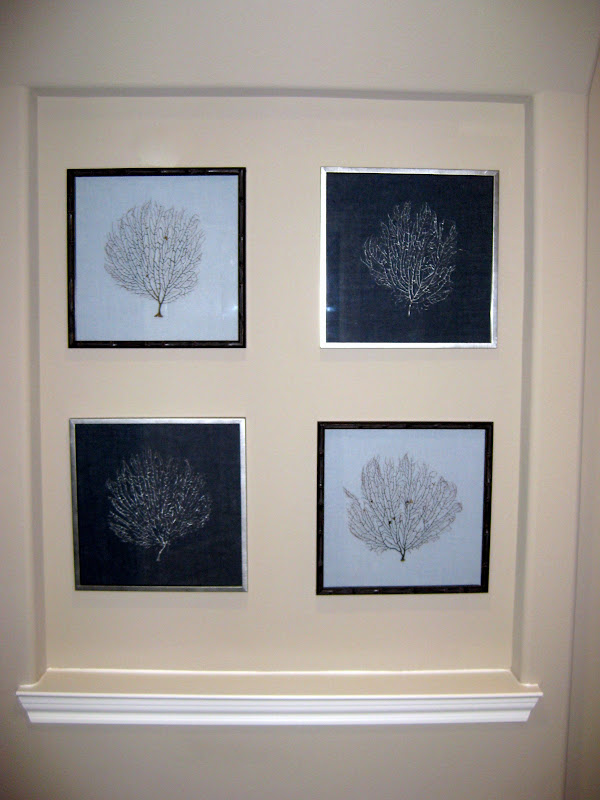
A few weeks ago I spied some lovely sea fans mounted on navy and sea blue linen for sale on One Kings Lane (email me for an invite!) and purchased four on impulse. They arrived on Friday and I'm thrilled with how lovely they are in person -- the dark bamboo frames in particular are very striking, but I also love how the sea fans mounted on the navy linen are painted silver...all in all, I'm one satisfied customer. In any case, I decided to mount them as a group in one of the two "art niches" that I permitted to stay in the building plans (they had about 6 in total!). They're now happily located under the archway that leads from the entry into the family room. I'm thinking about painting out the niche in a color. The question though is, what color? I have some leftover Drawing Room Blue, Parma Gray, Lamp Room Gray, and RL's Iron Gate from the other projects. Do you think any of those would work? Or do you suggest a bold contrasting color (maybe coral?)?
And what about you? How was your weekend? Did you get any projects done around the house?
Subscribe to:
Posts (Atom)


