As promised, this week I'm giving the world wide web a peak into my master bedroom. As with the study, I painted the room as soon as we moved in and I'm still happy with the color (Benjamin Moore's Phillipsburg Blue). You'll have to forgive my photographs: the flash on my camera is pretty awful and managed to cast a rather greenish glow onto everything. In person though, color is a true slate gray, and a bit darker than the pictures show. I love the color because it's dark and peaceful and makes the room feel very cozy -- almost cocoon-like, which I think is a good thing for a bedroom! Of course, all the white trim helps lighten things up during the day and sets off the architecture quite nicely (if I do say so myself).

This is the entrance to our bedroom -- there's a small sitting area off to the right and french doors lead out the backyard. One of the silliest things about the layout of this house is that the only way to the backyard through the house is straight through our bedroom. This has proven a little awkward when we're hosting parties or when we're grilling and having to trek from the upstairs kitchen, downstairs, and through the bedroom.

This our sitting area, which I've styled as a reading nook. The easy chair is the PB basic chair from Pottery Barn (but covered in an Ikea slipcover) and the ottoman is also from Ikea. The throw is from Restoration Hardware. The rug is the Maren rug from Pottery Barn and the side table and lamp are hand-me-downs from my mom. The black & white photographs on the wall are from our wedding.

The bookshelves (again, courtesy of my mom, but I think originally from Ethan Allen) hold part of our ever-expanding book collection. I don't have a lot of method to the madness, but they're roughly grouped by subject matter/author. I really hate bookshelves that aren't being used to hold books so, while I recognize it's visually cluttered, I like that they look well-loved. The objects scattered in the shelves are primarily from our travels, or gifts brought back to us from our friends' travels.

I love this little lady and I think she does a nice job of referencing the antique Japanese woodblock prints over the bed and tying the two areas of the room together. I got her from HighStreetMarket, a seller on Etsy who carries a lot of fun and one-of-a-kind vintage items of a more traditional bent. The candle is from my favorite Greek cosmetic company Korres.

Oh wing back chair, how I love thee -- let me count the ways. Firstly, I got this chair for free from my neighbor when we moved in. The chair was upholstered in a rather drab blue and sat in my guestroom for two years until I could figure out what to do with it. I'd been coveting the Grand Jubilee fabric in cream from Mod Green Pod (an Austin-based company that makes really lovely and modern organic upholstery fabric and non-vinyl wallpaper at great prices) since I spied it in domino ages ago. Last fall, when Mod Green Pod decided to relaunch their brand, the fabric went on sale for 60% off its original price. Deciding it was fate, I quickly snapped up 8 yards and took the fabric to a local reupholster. Six weeks later, I got the chair back and it's absolutely stunning. Oh, and did I mention this chair is also a recliner? 
Here's our bed, which is the Valencia sleigh bed from Pottery Barn. The duvet/euro shams are the Cole Stripe Silk bedding also from Pottery Barn -- are you detecting a pattern yet? When my husband and I got married, we registered at Pottery Barn and between wedding gifts and the discount we got on furniture afterwards (and we were starting with almost nothing), my house is definitely Pottery Barn-heavy. I'm trying to move away from that but since I can't afford to actually replace anything, I've been working on adding smaller, personal touches to avoid looking like a PB catalogue.
These are two of several Japanese woodblock prints I picked up from Fuji Arts on eBay. I had them custom framed and matted, and while the framing ending up costing me far more than I paid for the actual prints, I think it was worth it as they really elevate these small, inexpensive prints to art gallery-status.

Just another (albeit kind of blurry -- my camera really is cruddy) view of the space. The door across the bed leads until our bathroom. The door to its left (stage right) is our closet.

More woodblock prints courtesy of Fuji Arts. Obviously, I was inspired by Japanese art when I originally decorated this room.

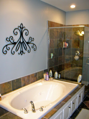
Above and below are shots of our bathroom. When we bought the house, the bathroom was painted a very, very dark gray, and, combined with all the slate tiles, only one small window and two small overhead lights, the bathroom was incredibly dark. We lightened things up by repainting in BM's Nantucket Mist (we used a pearl finish here actually so the light would bounce off the walls even more). We also took down the contractor-grade mirror that awkwardly spanned the entire vanity (really tough work actually -- mirrors that size are ridiculously heavy -- we ended up having to break the mirror in pieces to get it out) and replaced it with two Hutton mirrors from Restoration Hardware. I love how the frames of the mirrors echo the detailing on the cabinets.

The only art in the bathroom is that scrollwork from Crate&Barrel over the bathtub. I'm always so afraid that the moisture in a bathroom will ruin any good art so I try and put up inexpensive and/or indestructible pieces to decorate. I would like to up the ante a bit by doing some sort of special paint finish (maybe wide vertical stripes alternating between the pearl and a semi-gloss finish?), but that will probably have to wait until a few more pressing projects are completed around the house.
Coming soon: the "Great Room".


