ELLE DECOR’s first-ever Designer Showhouse is going on now in San Francisco. For months, the 5,000 square-foot Mediterranean style home in the heart of the historic St. Francis Wood neighborhood was taken down to the studs and renovated. The interior was transformed by eleven of the San Francisco’s most talented interior designers – all of which were handpicked by ELLE DECOR.
Today I will be showing glimpses of the Master Bedroom and Bath created by A-list interior designer, Jay Jeffers. Founded in 1999 by Jay, Jeffers Design Group designs a wide range of projects from studios in San Francisco and Los Angeles. Principal Jay Jeffers leads the design of every project, supported by Senior Designer Kelly Hohla and an experienced team of designers, architects and project managers.
Today I will be showing glimpses of the Master Bedroom and Bath created by A-list interior designer, Jay Jeffers. Founded in 1999 by Jay, Jeffers Design Group designs a wide range of projects from studios in San Francisco and Los Angeles. Principal Jay Jeffers leads the design of every project, supported by Senior Designer Kelly Hohla and an experienced team of designers, architects and project managers.

Jay and his team designed a glamorous master suite that is tranquil, sophisticated and inviting. It's one of my favorite rooms in the showhouse. The gorgeous bed takes center stage and is flanked by bedside scones from Urban Electric and Marc du Plantier gilt finished tables from Therien 20th. A geometric fabric from Holland & Sherry was used for the custom bed coverlet. The custom bed headboard and base fabrication by Thomas Sellars Furniture is Jay’s favorite element in the room.
The suite’s neutral color palette might be a surprise for those who have seen some of Jay’s more colorful designs. In this instance he uses a soothing color palette is dominated by hues of gray, creams and sand. Pops of teal are introduced in small doses on the bed’s shams and throw pillows {above} and on a pair of benches at the base of the bed {below}. This is indeed a space both genders would feel at home in. Jay also mentioned that the design reflects his personal design sensibilities and tastes. Mine too!

The benches from Svenska Mobler were reupholstered a jewel toned Jim Thompson fabric. The geometric design is echoed in the hand-painted ceiling by Willem Racke Studio {below}.


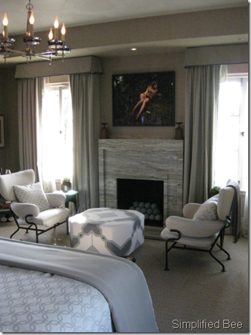
Opposite the bed is a simple, yet stunning marble fireplace and an inviting seating area. A chandelier from Habite is hung in the center of the room and adds just the right romantic touch. A stunning ottoman with custom embroidery & applique of fabric from Holland & Sherry is flanked by a pair of arm chairs by Franco Albini from Eccola.

Here is a better look of the custom upholstered ottoman. Can you see the hints of teal embroidery and applique in the mosaic pattern? It is an exquisite piece of furniture.

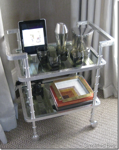
In the back corner of the room, Jay placed a chic custom-designed metal bar cart by Paul Benson. It’s just the right proportions for the space.

A modern Samuel Marx Parchment Secretaire Cabinet from Modern One provides glamorous vertical storage.

The thorny branches in the mirror by Blackman Cruz mimic the softer branches in the stone console table below. The walls are covered in a gorgeous woven metallic grasscloth by Phillip Jeffries – it has beautiful silver undertones that give it such depth and elegance.

The master bath features a generous shower, bath and dual sinks. The raised glass sinks and wall mounted bath fixtures are by Kohler. Typically I am not a fan of the raised sink, but in this case the sink’s low profile and generous bowl won me over. The modern white vanity is topped with a warm Silestone.

Here is a closer look at the beautiful mosaic stone tile by Ann Sacks. Do you recognize the mosaic pattern? It echos the one on the ottoman in the bedroom’s seating area.

Basic Ann Sacks tiles cover the floor, shower and bath surround and create a beautiful textured pattern. The more refined, simpler pattern is a nice juxtaposition to bold mosaic. The walls in the bathroom as seen behind the tub are plaster that was hand-painted by Willem Racke Studio. The application is stunning.
Isn’t this a spectacular master suite? I love the repeated patterns, harmonious color palette and mixture of materials & period styles. What do you like?
PS - And in case you missed it, here is a tour of Grant Gibson's teen bedroom design in the ELLE DECOR Showhouse...
* all photos by Cristin Priest for Simplified Bee