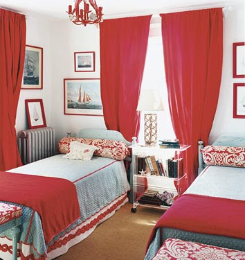
designed by Jeffrey Bilhuber
Outfitting a room in complimentary colors (which are two hues that are opposite each other on the color wheel), like red and green, has long been a designer's trick to achieving pleasing visual contrast in a space; however, these complimentary pairings (blue/orange, yellow/purple, red/green) can often read as very traditional. To get a more modern feel, try adjusting one or other of the hues slightly (e.g., green to turquoise or blue). Right now, I can't get enough of spaces with red and blue accents -- especially when the blue is cool robin's egg blue or a vibrant turquoise.

domino, May 2008

domino, June/July 2008
I love both of these guest/kids' rooms from domino. While the first is decidedly more traditional, the red chandelier and red picture frames keep it lighthearted. In the second, I love the graphic contrast of the black and white rug with the solid walls and bed linens. Such a great statement. And the best part is those red bed frames were from Target (and still available on their website here)! Now if only another American shelter magazine could integrate such budget-friendly items into its spaces....
designed by Tobi Fairley
The rug in Tobi's space is very Jonathan Adler to me, and I think it's such an interesting contrast to the very traditional furnishings and fabric. The differing scale of the patterns keep it from being overwhelming, though it's admittedly a busier look than a lot of people like.

This space is actually from Serena and Lily's catalogue and I love how the red/blue color scheme is tweaked to hot pink/robin's egg blue to suit a little girl's room. It's fresh and young, but still sophisticated, especially when paired with the white built-ins and Jonathan Adler ceramics.
designed by Katie Ridder
I know I posted this picture only a few days ago, but I couldn't resist including it in this post again. I'm just completely in love with this space.

LivingEtc, March 2009
Leave it to British mag LivingEtc to really turn it up a notch. Everything in this room, from the colors to the butterflies to the wallpaper is just completely on-trend.
.jpg) This is actually from wallpaper purveyor Graham & Brown, but it's an excellent illustration of how a bright cherry red can work beautifully with a paler green-blue. By the way, the wallpaper featured in the photo is called Viva by Barbara Hulanicki, and is priced at a reasonable $60 per double roll.
This is actually from wallpaper purveyor Graham & Brown, but it's an excellent illustration of how a bright cherry red can work beautifully with a paler green-blue. By the way, the wallpaper featured in the photo is called Viva by Barbara Hulanicki, and is priced at a reasonable $60 per double roll.And last but not least, a few of my favorite red and/or turquoise items, perfect for a pop of color just in time for spring:

