Showing posts with label dining rooms. Show all posts

Thursday, June 2, 2011

Interview with New York Interior Designer Sara Gilbane

Earlier this year, the seasoned, Traditional Home and youngster, Lonny collaborated to create a new digital shelter magazine, TRADhome. In it’s debut issue, TRADhome names 20 New Traditional Designers to Watch. On the coveted list is New York-base interior designer, Sara Gilbane. She is known for her classic modern-traditional style and artfully combining low-key and elegant pieces. Sara’s interiors are chic, yet grounded in practicality.
 
blue-white-suzani-bedding_thumb1
Simplified Bee: When did you know you wanted to be an interior designer? 

Sara Gilbane: After my first day of work at Kemble Interiors. I was thrilled to be working with Celerie Kemble and Christina Murphy and once I dove into those fabrics I never looked back!
blue-and-white-kitchen-banquette-noo
SB: How would you describe your personal style? 

SG: I come from a traditional background and love bold color and pattern mixed with neutrals. My style has a bit of an eclectic loved feel with a sense of calm.

sara-gilbane-living-room-tradhome_th
SB: Who would you most like to collaborate with on a project? 

SG: Architects Peter Pennoyer or Gil Schafer. 

favorite interior designer paints gilbane_thumb[1]
SB: Do you have “go to” paint colors? If so, which ones? 

SG: Benjamin Moore Linen White, Dove White, and Super White are always used on my moldings. Farrow and Ball Skylight is another favorite- a pale grey blue that makes you feel like you have been enveloped in a cloud.

sara-gilbane-bedroom-canopy-suzani_t
SB: Which of today’s interior design trends are here to stay and which ones will we see fade away?

SG: Ikat, zebra, sisal, jewel tones, reclaimed wood, and bold color are all trending but they are classics and will never go away. Perhaps neon is one trend we will (gladly) see go.

sara-gilbane-bedroom-greek-key-beddi
SB: Where do you recommend clients splurge versus save? 

SG: Splurge on drapes, wallpaper, and a custom sofa ( you will LIVE on this for 20 years and it will be amazingly comfortable). Save on cocktail table, side tables, lamps. With this splurge/ save combo the splurge items are so unique people assume the rest of your pieces are special. Then again.... if you fall in love with something, buy it. Since you love it you will always find a way of working it into your next home.

gray-white-linen-dresser-nursery-roo[2]
raspberry-storytime-rocker-chic-nurs[2]
SB: I love the timelessness of the nursery you designed that was featured in TRADhome. Tell us about your favorite design elements in the space. 

SG: We used a classic wool rug with a timeless geometric pattern in charcoal grey, celadon green, and slate blue to hide stains. The room had a tremendously high ceiling so we added silver star wallpaper on the ceiling and a custom painted pale blue and white circus tent stripe on the walls to add a sense of whimsy to the room. The deep mulberry colored rocking chair is one of my favorite pieces. It is so comfortable and the shape makes it perfect for a growing child ( not stuck in a nursery forever).

built-in-bookcase-and-bench-window-s[2]
SB: You are embracing social media and write a blog {Travel for Design}, are on Facebook and can be found tweeting {http://twitter.com/sgilbane}. Do you prefer one over the other? What is your advice to other interior designers who are timid about trying social media marketing outlets? 

SG: I love the blog though I do not have nearly enough time to update it as much as I would like to. I need to be better with tweeting! I would advise other designers not to be timid. I was not sure anyone would read our blog and we have over 6,000 hits a day! Go forth and blog, tweet, and tumble!

lotus-pendant-lighting-dining-room-t[1]
SB: Fill in the blank. No room is complete without… 

SG: Art.

chic-paisley-headboard-nailhead-trim[2]
SB: What’s next for Sara Gilbane Interiors? 

SG: I would love to design a range of fabrics and wallpapers for one of the fabric houses. I am fabric obsessed!

Thursday, April 21, 2011

My Dining Room Gets a Face Lift


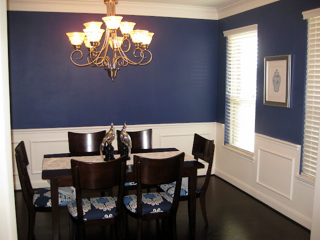
Last weekend while my in-laws were in from Florida for a visit, I finally found the opportunity to recover my dining room chairs. In our old house, I had covered our dining room chairs in a pretty (if a little bit dark) print from Marimekko, but the purple-grey and black print was all wrong for my navy and white dining room. Since moving into our new house in July of 2009, I had put off recovering the set, assuming I would be upgrading my dining room furniture in short order.

Well, flash forward nearly two years later and that dining room set is still there...and not going anywhere anytime soon thanks to a baby and a very expensive backyard renovation. And so, having resigned myself to keeping my furniture for another few years, I decided I should finally get around to recovering the seats. I scored two yards of a pretty blue and white print from Mod Green Pod at 50% off a few weeks ago that's much more in keeping with the room. I won't go into the process of recovering seat cushions as there are a plethora of how-to's online right now (and frankly it's super-easy...if you can wrap a present, you can recover a seat cushion).


I love how the print manages to brighten up the whole set -- sorely needed given the dark tones of the wood, especially against my dark wood floors. I've attempted to bring even more light to the center of the room by adding a white and silver runner from John Robshaw that I scored on One King's Lane a few years ago and a pair of silver peafowl from Joss & Main (yes, I love sample sale sites!). The lovely ginger jar print on the wall is by Anne Harwell and the frame is from ZGallerie.


I'd like to perk this room up a bit further with two other additions: either some great wall art or a mirror for the lone wall (which is visible from the entryway) and some fabulous drapes for the two windows on the left wall. While I continue to hunt for the perfect piece for the wall, I'm working on the drapes right now. I'm in love with Iman's new fabric line IMAN Home available at Calico Corners and have decided to use one of her fabrics for the drapes...the question is, which print?
While I'm leaving heavily towards Option A with its two shades of blue that coordinate with the seat fabric and its larger scale print, I wanted to take a quick poll and see what my readers thought. Besides, who doesn't love a poll?

So you tell me, what do you think?


  • Option A
  • Option B
  • Option C
  • Option D
  • None of the above. I have a better idea!

Wednesday, April 20, 2011

Hanging at Brooklyn Limestone

Today I am blogging over at the fabulous Brooklyn Limestone blog where I will be sharing my favorite “nook” in our house.

Here are some hints...


sb dining table

xo,

Monday, February 14, 2011

Dash of Modern, Pinch of Traditional Interior Design

modern baby girl nursery room designer
This sweet modern nursery room was featured in a previous Simplified Bee blog post focused on Girly, Girl Bay Nursery Room Designs. I recently came across the article in Style at Home which featured images of the rest of this Vancouver Arts and Crafts style home and wanted to share them with you.

family room oly furniture cow hide rug
To help decorated the home, the owners turned to designer, Peter Wilds from boutique, The Cross. His task was to artfully blend the couple’s modern taste with the home’s classic look. A neutral white & gray color palette with blue accents is carried throughout the central living spaces. In the family room which is open to the kitchen, the walls and trim are washed in white.  A tobacco leather sofa is paired with the Oly Studio Pico Cocktail table. This round table has a beautiful scalloped shell top and industrial iron base. The spectacled cow hide rug provides wonderful texture and contrast.

white modern classic kitchen
Here in the all white kitchen you can get a good sense of how dark the wood flooring is. The classic white kitchen cabinets are paired with white ceramic subway and carrera marble. I love the white wooden stools with gray cushions selected for the kitchen island.

full length mirror dining room
In the dining room, a midcentury style Saarinen table is paired with traditional ballroom-style chairs. Painting the chairs a gray-turquoise is a wonderful way to carry the color palette throughout the space. The full length mirror and crystal chandelier add playful touches of glam to the room.

grey and turquoise designer living room
In the living room, the furniture arrangement emphasizes on the room’s focal point, the traditional fireplace and the painting by Douglas Walker. Again, cool whites and grays are mixed with bright pops of blue. The clear, modern coffee table helps keep the space light and airy.

designer modern traditional living room
Across from the sofa in the living sits a pair of white upholstered armchairs with contrasting nailhead trim. They flank an Oly Studio Pipa side table in pierced resin. The side table’s squiggly pattern is repeated in the Elisabeth bedside table also by Oly that features a beautiful woven pattern over an antiqued mirror. The same side table and silver lamp is placed on the other side of the fireplace for symmetry.

airy white bedroom design
In the bedroom, the cool color palette continues, however the cool blue accent color is replaced with warm and rustic reds. Centered above the bed is a modern, white flower mirror. You can find one similar here. Large ikat pillows are a perfect finishing touch on the bed.

Is this modern classic home fit your personal style?
*all photography by Janis Nicolay via Style at Home

Tuesday, January 11, 2011

8 Reasons I Love this Dining Room


1. The rose print linen on the walls and chairs is feminine, but the oyster and grey colorway and grid pattern keeps it from being overly sweet.

2. The more modern mix of wingback and Parsons chairs is a great counterpoint to the traditional Louis Philippe table.

3. The settee -- I love bench style seating in any dining space!

4. The silver leaf screen; because every dining room needs a touch of elegant Chinoiserie.

5. The painted tin ceiling adds character and texture without distracting from the upholstered walls.

6. The simple panel drapery mounted on a bamboo rod lends a more casual and modern air, despite the floral print walls and strong use of metallics. 

7. The sisal rug takes the entire look down a notch and warms up all the gray.

8. A tight monochromatic color palette keeps all the pattern from overpowering the small space.

So what does all that add up to? One great room in my opinion! But it also showcases a new twist on classic English style, which I think we'll be seeing a lot of in 2011. Classic English decorating is marked by floral fabrics, matching prints, tin ceilings, touches of Chinoiserie, an eclectic mix of modern and antique furniture. Windsor manages to make this style feel fresh, young and a bit more undone with the addition of the sisal rug, less fussy drapery and a more monochromatic color palette. 

What do you think? To see the rest of this gorgeous California home, check out the House Beautiful feature HERE.

Thursday, September 23, 2010

Natalie Umbert makes me happy.


Last week I was flipping through the latest issue of Town and Country and saw this picture included in their feature on up and coming LA designers -- and I stopped dead in my tracks. Now this is the type of room that just makes me happy: bright colors coupled with lots of crisp whites and a great mix of patterns and styles. So of course I had to google the designer behind such a great room and boy was I not disappointed.

Natalie Umbert's portfolio is, start to finish, just as jubilant, fresh and eclectic as I had hoped. In short, I have a new design crush -- and a serious and new found appreciation for the color orange.

I'm so in love with that window seat. And all the built-ins around the fireplace. Okay and those floors.


I love the colorful patterned backs of these charges -- such a great injection of color into an otherwise neutral space. I also love the juxtaposition of the very casual floor and rug with the formal coiffured ceiling. Gauzy linen drapes and a capiz shell chandelier bring in a beachy vibe.

I actually just got back from an all too brief trip to Pasadena, CA, late last night and I'm still definitely California dreamin'. The weather just could not have been better (or a more welcome respite from the humidity we've been suffering through all month). In any case, this room just screams California beach to me with its bleached floors, clapboard walls and brilliantly fresh combination of orange and aqua. So spot-on.

The orange Eames Eiffel base chairs are a classic choice, done up more playfully in orange. I do wish the rug underneath the Saarinen table were a bit bigger though, I prefer a rug large enough to cover the floor area underneath the table and the chairs.

More orange and aqua, but this time in a more saturated setting. I love how you can go with just a few hints of bright color set against a white backdrop for a calmer, more casual air or really go all out for some major drama. The palette stays the same, and yet the mood is so drastically different. The Chinese wishbone arm charms all done up in bold orange lacquer and fun stripes are my favorite elements in the space.


Another view of the same room. Note how Natalie goes with just one large piece of art on one wall and a large mirror over the fireplace. I'm a big fan of using just a few large-scale pieces on your wall and with this bold wall color and all the ample patterns on the soft furnishings, not only do you want to avoid cluttering up your walls, but smaller pieces would really just get lost here.


Natalie's portfolio has a separate section entirely devoted to children's rooms. I absolutely love how she picked up on the hot pink of the Serena & Lily bedding with just the narrowest of pink stripes on the walls. The wide spacing makes the small room appear larger and less busy than a more traditional stripe would have.


When I first saw this room I couldn't help but think: "Okay, that's a pretty sophisticated kid's room", especially with the fairly tight black, white and silver color palette. The playful rug does inject a more youthful note, but it's the feature wall of silver-foiled wallpaper that I really love.

Wednesday, May 5, 2010

DC Designer Liz Levin's Kid-friendly, Stylish Home

When Washington DC-based interior designer, Liz Levin became a new mom she discovered few stylish furniture options that were kid-friendly. As a result, she founded Nesting - an all-in-one resource for contemporary, high performance furnishings specifically selected and designed with children and pets in mind. Yippee!
Liz used her own home as a laboratory and many of her furnishings are from her store's collection. In the living room, Liz mixes design styles and balances feminine and masculine elements beautifully. The table skirt was made custom by Liz Levin Interiors in Rogers and Goffigon {cream texture} with trim fabric by Schumacher. A fun Lucite waterfall coffee table from CB2 serves as a coffee table {note the rounded corners - kid-friendly!}. Liz sells a higher end version on Liz Levin NestingThe most striking element in the room however, is the stunning wallpaper by Cole & Son  behind the dark chocolate sofa. The colorful print {Fornasetti Collection Frutto Proibito} pulls together the room's color palette brilliantly. The remaining walls were painted in Benjamin Moore's Manchester Tan and is a nice contrast to the dark remnant wool wilton area rug.

The Murano glass table lamp and round brass vase add just the right vintage touches and were purchased at Sixteen Fifty-Nine in DC's Georgetown. The red, pink and white t.v. time chair {"deliciously comfortable" as Liz puts it} is covered in a cutting edge, stain-resistant upholstery fabric that uses Nano-Tex technology and adds a punch of color. Stylish and functional - love this!
Above the living room's fireplace hangings original artwork by Barbara K. Buer. I love how Liz flanks the fireplace with highs and lows - an antique Chinese garden statue from Qi in Old Town Alexandria, VA and a sweet child's rocking chair found at a local flea market. The fuchsia nesting chair {Hollywood 2} is also made in high performance fabric, yet has a fashion-forward look. {We need to know how she sold her hubby on the bold, feminine color choice!}

In the dining room, Liz opens up the space visually with a large custom mirror and floor length drapes in a fun brown and white geometric print. The dark wooden dining table was a passed down from a family member and looks amazing with the Design Within Reach white leather chairs Liz scored off of Craig's List. The drum pendant lighting is by Visual Comfort and is available through the trade.

This fun and colorful space is Liz's "catch all" room. It serves as a home office, play area and guest room so the design needed to incorporate furnishings that were functional and flowed visually. The striking red and white "Merlin" wallpaper by Albert Hadley {through Hinson/Brunchwig & Fils} was a splurge and sets a playful tone. Liz selected the sleek white Parsons desk from West Elm and paired it with an Ikea chair - both very affordable. A fun red bamboo style floor lamp from Arteriors {available through the trade} helps with needed task lighting and balances the space visually. Artwork stacked above the cherry red file cabinet are finger paintings by her daughter and set in frames from Pottery Barn. I love to see children's art framed and showcased for all to see.

Keeping within a tight budget, Liz selected the children's table and chairs from Ikea - can't bet Ikea prices! Liz hung a whimsical poster that beautifully picks up a yellow and white zigzag accent pillow on the West Elm Storage Bed Frame {pull out draw provides more storage options}.

In the bedroom, Liz covers the bed in dark brown bedding by DKNY. The turquoise and white circle print accent pillows were made custom while bolsters were from West Elm. A sweet Lucite tray table from Alba Interiors Lambertville, NJ is the perfect bedside table. Framed artwork from Liz's travels to Brazil and Hong Kong are stacked, while a larger "For Like Ever" print hangs above the bed.
 

Liz mixes styles and adds ethnic touches on a dresser. The vintage turquoise Chinese Foo Dog from Qi in Old Town Alexandria, VA is handsome next to the modern Paris lamp from good old, Target. The rrom's walls were painted a soothing Palladian Blue by Benjamin Moore.
In the baby's nursery room, Liz keeps it bright and cheery with the walls painted in Farrow & Ball Hound Lemon. She placed a white classic spindle crib from Land of Nod {before many of the crib recalls of this type - please make sure if you are given a crib it has not been recalled} centered between a glider and toy bins. The sweet and sassy curvy side table in white is one of my favorites and is available at Liz Levin Nesting. It is perfect for any room in the house! 

Floor length drapes in yellow with a green panel nicely frame the windows. While large, colorful stuffed animals in the green and yellow color palette add to the playfulness of the room's decor. Liz keeps the amoire and changing table {Land of Nod} neutral white and consistent with the other furnishings in the room.

I am still drooling over the Cole & Son wallpaper in Liz's living room? What caught your eye?

Be sure to check out Liz's lovely design portfolio and visit Nesting for kid-friendly furnishings and great design advice.


*images courtesy of Liz Levin Interiors

Thursday, March 11, 2010

Formal Dining Rooms


Earlier this week Cristin posted about decorating dining rooms over at Simplified Bee and it's gotten me itching to start decorating my own dining room (to get a feel for what I'm going for, see HERE). When we first moved in, we managed to paint out the trim on the lower third of the room to resemble wainscoting and paint the balance of the walls a deep blue (Farrow & Ball's Drawing Room Blue), but that's all the progress that's been made so far -- and unfortunately, until my budget recovers, that's all the progress that's going to be made for quite some time.

But that doesn't mean a girl can't day dream, right? In fact, I'd say a temporary cash crunch can be a good thing for designing a room as you're forced to window shop in favor of actually, well, shopping. This forced abstinence allows you the time to really get a feel for what you love most (rather than what you love today or what your budget allows you to buy today). And, when you finally do have the luxury of going out and buying new pieces, having curtains made, etc., you know the market, the trends and what it is you're really after.

So here are a few of my absolute favorite dining rooms, collected over the past few months as I continue to contemplate the transformation of my small dining room into something truly spectacular.

For me, a formal dining space should be exactly that: formal. It should also be luxurious, dramatic and special. After all, these rooms are for special occasions, most of them occurring at night. So I say work with that and go for lots of drama: crystal, gilt, mirrors, silks, velvets, dramatic colors, hand painted wallpapers...you get the idea. If you're looking for a good guide on how to incorporate all that and more without making the room feel overdone or too stuffy, you need look no further than Kara Mann's gorgeous gray dining room (above) that was featured in last month's Traditional Home. I particularly love the silver-leaf finish on the mantle against the Carrera marble surround.

There are those that argue that formal dining rooms are dinosaurs; that the modern family does not need to distinguish between public and private rooms, formal and informal settings. And that's certainly true to an extent, but at the same time I love the idea of the luxury of having a formal dining room. The luxury of having a place at home to celebrate truly special occasions. The type of room that is filled with memories yearound, even if it is only "used" a few times a year (though certainly there is nothing stopping you from using your formal dining room -- and your formal china -- on a regular basis, and I completely encourage this!).

In this dining room designed by Hillary Thomas, I love how the trim and wainscoting is painted out in a high gloss sage green. It's such a great way to modernize very traditional architecture (and the very traditional wallpaper). The glossy green also works well with the dining chairs, which are done in a high glass black with a sage green seat.

Ruthie Sommers

Wainscoting and wallpaper (especially handpainted wallpaper) are two of my favorite design elements for a formal dining room. The sea grass rug and lack of window treatments make this room feel much lighter than many of the others -- and also more approachable. For me, this room is the perfect balance between formality and luxury, on the one hand, and practicality and comfort, on the other.

Christina Murphy

A simple formula for high drama in a dining room is dark bare wood floors, metallic wallpaper and a crystal chandelier. The mirrored insets into the paneled doors is a simple and inexpensive way to add a little extra sparkle and to dress up an otherwise standard feature. I also love the Kartell Mademoiselle Chairs, with their lucite legs and low backs.


Here, I love how the dark slate walls contrast with the high impact turquoise chandelier and hot pink upholstered dining chairs. I think my first inclination would be to pair colors like this with a predominately white backdrop, but Katie demonstrates here how success dark walls with bright furnishings can be. I also like how she kept it from feeling too cave-like by having a lighter colored rug on the floor. This lightness is similarly reflected on the ceiling, which appears to be papered in a subtle tonal damask.

Pastoral murals in dining rooms are very, very traditional. In fact, you can see many fine examples of them in homes in Pompeii. Here though, the brighter colors in the mural and in the fabrics lend a rather whimsical quality to Thad Hayes' space. So much so that it feels almost cartoon-like.

Anyone else remember Ondine from the second season of Design Star? [By the way, is that show ever coming back? I loved it!] In any case, Ondine is back and in the running for Traditional Home's Young Traditional Designer of the Year. Flipping through her portfolio, I fell in love with this dining room. I love the juxtaposition of the almost Medieval architecture with the vibrant pinks. In fact, I'd happily steal that set of Ikat chairs and the hot pink buffet for myself. How fabulous would that look against navy walls?

Nathan Egan is one of my favorite designers for subtle drama. Rooms like the dining room above show that you don't need bold colors or expensive, embroidered wallpaper to make a big impact. I also love how the oversized photograph is hung between the wall and wainscoting. The gesture feels almost haphazard, but the effect is incredibly striking. I also love the large wine barrel chandelier -- sure, it's been trendy, but there's also a nice rusticity about it that works so well with more traditional interiors.

One of my all-time favorite dining rooms, by the near-faultless Suzanne Kasler. While I usually prefer trim painted-out white, the blue lacquer that Suzanne applied to both the walls and trim here is incredibly striking. I also tend to prefer matching chairs (or at least matching side chairs with a pair of larger chairs for the ends), but yet again Suzanne proves here there's no "rule" that I can come up with that can't be successfully broken.

This dining room was featured in a spread House Beautiful did last year on a beach house Annie Selke decorated and I absolutely fell in love with all of it. I love the mix of patterns here as well as the mix of blues. A deft hand is needed for this type of mixing, but Selke is skilled at mixing both patterns and colors in a way that feels very modern, without any of the eclectic-bohemian element that I'm admittedly not a huge fan of.