What with all the doom and gloom bandied about right now, I'm finding escape in the colorful interiors of designer Katie Ridder, which manage to straddle traditional and modern decor with ease. Here, an otherwise white room is punched up with splashes of red (that mantle is amazing!) and blue. Bonus points for employing a red, white and blue palette and avoiding even the faintest patriotic theme.
In this dining room, the combination of turquoise and red is just so fresh and modern. The more detailed Italian influences (the Murano glass chandelier and dining chairs upholstered in Missoni fabric) are such a nice counterpoint to the otherwise minimal decor. I'll admit though that this room would be drastically improved if the wall-to-wall carpet was replaced with dark hard woods -- but couldn't most rooms? The red ceramic table lamps are also a wonderful touch -- you can find a similar look over on Overstock (at under $100 for a pair!), but I'd swap out the standard issue drum shades with something white and sleek.
I'm really starting to like all the painted glass backsplashes I've been seeing lately, especially when they're in such a bold hue. I also love the sleek white countertops; what a welcome change from granite (which I am rapidly tiring of...just so predictable!).
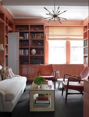
I don't normally like coral, but the color here seems just right for this library. The high gloss paint on all the cabinetry is a great way achieve the look of lacquer without the cost and the sheen reflects, rather than absorbs, the light. The space-age light fixture is also a nice (albeit surprising) touch.
Those giant windows and high ceilings are enough to make me love this kitchen. Throw in cabinets that reach the ceiling and the industrial stove, and I'm in full-on kitchen lust.
This is a great example of decorating around a single print (here the rug) and letting it dictate the rest of the space. All the gray is so soothing, too, though I'd swap out the Jetsons-esque coffee table for something more sophisticated (which would be a better contrast to the carpet). Also, is the white chair pictured above the same as the red chairs in the first picture? I'm thinking "yes"....
Right now I love just about any bathroom that takes small mosaic tiles and puts them everywhere. The blue and white is particularly fresh (and seems to be something of a Katie Ridder signature), but the single shot of orange flowers really kicks it up a notch. Also, isn't that light fixture to die for? If anyone knows who makes it, let me know!
A very nice use of wallpaper -- interesting without being overpowering. It lets the staircase (rightfully) be the star of the show. You can achieve a similar look with Osborne & Little's yellow damask pattern from their vintage collection or Marcel Water's Grace or Stella, both available through Graham & Brown.
Again with the dining chairs upholstered in two fabrics (pattern on the outside, solid on the inside). What a great way to make ordinary chairs special. You can find a similar style to these chairs at Calico Corners (which can then be upholstered in your choice of fabric). For a much cheaper option, try West Elm's curved upholstered chair, which could be reupholstered for a similar look.
All photographs courtesy of Katie Ridder.


