Last Saturday Dave and I took Dave's grandmother and her best friend on a tour of our new house. Both widows in their 80s, these ladies drive around the South and Southwest volunteering their time and energy to various Christian charities and churches and I am constantly amazed by their energy and faith and we had a great time visiting with them. In any case, as promised, I took a few pictures of the inside to give y'all an update on the progress. I am still amazed at how much progress has been made in just about a month's time. After all, just a few weeks ago, the house looked like THIS.
When you step into the house, you're greeted by this two-story entryway and gently curving staircase (both two of my favorite features in the design). On the immediate right is the dining room; on the left, the study, which will be separated from the hall by french doors. Straight ahead is the family room, with kitchen off to the right. The family room's primary feature is a huge wall of windows that overlook the backyard (right now, just a bunch of Texas red clay). The other prominent architectural feature is the fireplace, with large nooks on either side. Once we move in, Dave and I are hoping to create some built-in shelves/storage in each nook for books, pictures, and maybe even a small TV. This picture was taken from the kitchen, which will be separated from the rest of the family room by a bar-height counter.
The original plan also had a large nook over each of the lower nooks as well as over the fireplace. Fearing too many holes would make the wall look busy and just become collectors of useless ephemera and dust, I had them removed.
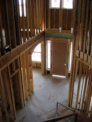
Since we toured the house late in the day, the long shadows made it difficult to photograph many of the rooms. Here's a shot though of our master bath in its current state, complete with the tub smack in the middle of the room, and a view into the closet and study beyond. The entryway from the top of the stairs. I love the west-facing clerestory windows at the top, which will let in plenty of afternoon light.
Here's a shot of the exposed ceiling on the second floor. At this stage you can still see everything, including the huge amounts of wiring running through all the walls and up clear to the roof. Unfortunately, I paid absolutely no attention to the location or number of recessed light fixtures in the house when we customized the plan. Since so many homes seem to come with limited lighting, I may have been a little afraid to actually get the answer and had already
factored into my budget the likelihood of having some installed myself. After taking a close look though, the house appear to have ample lighting in the "public spaces", though it looks like I'll have to be added much of my own lighting to the bedrooms (which is fine, since I think recessed lighting can be a bit harsh for a bedroom anyway). 
Alas, this picture is almost too dark to be worth posting, but I went ahead and included it anyway so you could see the window seat that's going into one of three bedrooms upstairs. I've always loved the idea of a window seat (though in practice how often does one actually sit in it?) and completely forgot that one was included in the design, so this was a very nice surprise on Saturday when I saw it.

This is Dave's "man room" (also known as the media room). The curved ceiling and small windows should give the room a nice, cozy feeling. By the way, does anyone know why some of the lumbar is hot pink? We had Borax (an anti-termite treatment) put on the lumbar used in the foundation, but that turns wood bright blue, not pink, so I have no idea why we've got pink here.
This week, much of the construction will be on hold while various inspections are done to confirm all the wiring, etc. is correct before they Sheetrock the walls. Once Sheetrocking begins (hopefully next week!), things will really start to come together and I'll be back with more updates.


