Tuesday, June 30, 2009

Converting the Unconvertable

As I've mentioned before, Dave has a general dislike for wallpaper. I'm not sure if it's the expense (compared to paint), the difficulty in putting it up (not to mention taking it down) or just that he still associates wallpaper with the hideous cartoon borders and "grandma" florals that dominated our childhoods in the '80s and early '90s.

I tend to view Dave's resistance to something as a challenge to convert him to my way of thinking. I knew though that if I could find the "perfect" wallpaper for Dave, that he'd not only relent and let me wallpaper at least a few rooms in the new house, but that he may even end up liking the final result. Now there are a few things I know about my husband's taste: (1) he likes jewel-tone blues and greens, (2) he likes metallics, (3) he likes nature-inspired themes, and (4) he likes intricacy and ornate patterns over simplicity and geometics.


Last week I found this, the perfect wallpaper for Dave. It's from Graham & Brown and called "Enchant - Ultramarine". It hits all the right notes and in person it's even more beautiful as the trees have a translucent quality that make them appear as if they'd been carefully silk-screened, one by one, onto the paper (Graham & Brown will send you samples free of charge, you just pay shipping). What's interesting is that, while I suggested this wallpaper for the powder room, Dave loved it so much he wants to do an entire wall of it in his "man" room, and then paint the rest of the room in a coordinating shade of teal. I'm not entirely sure if the end result will be particularly masculine, but I do think it will be beautiful.

But now the important question:

While I managed to convince Dave of the virtues of modern wallpaper, we still need to decide on the "perfect" paper for the powder room. I've narrowed it down to our two favorite choices (Sariskar Banswara by Henry Wilson for Osborne & Little and Stella-Amethyst by Marcel Wanders for Graham & Brown) and would like to open this one up for a vote.


Dwell on Design - Shed Me

Yesterday I was dreaming about a very girlie girl office. Today, something modern and sleek. Maybe I need two offices to satisfy both of my design cravings.

Another great vendor at the Dwell on Design event was Modern-Shed, a company that sells these fantastic pre-fab chi-chi sheds that go in your backyard.

In my future (modern) dream home, I would love one of these in my backyard (preferably near my imaginary pool) for my office. See the fabulous images below:


There are lots of eco-friendly options as well: denim wall insulation, cork flooring, FSC certified wood (sustainable and responsibly harvested)...

This is another eco-chic-o find!

Monday, June 29, 2009

Week Nine: Lights Up!

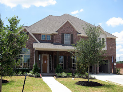
Hope everyone had a great weekend. I'm back again today with my weekly update on the progress over at the new house. [By the way, am I overloading you with new house pictures and posts?] We visited our soon-to-be-home on Sunday and were surprised to see how much progress had been made over the course of the past week. With the exception of the front door (which has not yet been installed), the exterior of the house looks 99% complete. I was particularly pleased to see that the columns got a good dose of "Afternoon Tea" to match the shutters.

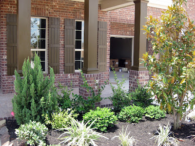
Despite soaring temperatures and a continued drought, my builder saw fit to go ahead and landscape several weeks prior to completion -- fortunately for me, if they'll be obligated to replace the sod and/or any dead plants prior to closing. I just hope they water liberally. While I'm sure Dave and I will fill-in these beds a bit more (especially the ones left bare underneath the oak trees), I'm fairly pleased with their "standard" landscaping package.

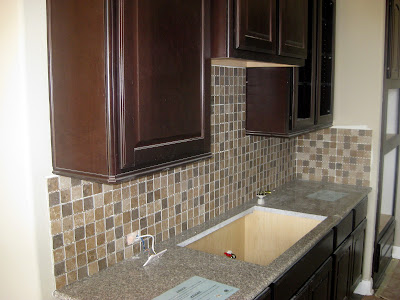
Aside from the exterior, the most progress was probably made in the kitchen, where the backsplash was tiled (but not grouted) and the granite countertops were installed. Overall, I'm happy with interplay between the backsplash and the counters, though I still wish I'd been given some more options for backsplash (or that they'd let me install my own later). Ah well. I'm going to have to let that one go.

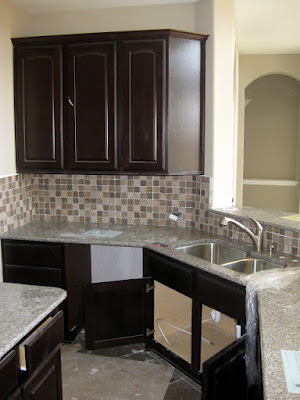
Another view of the kitchen. This sink and faucet were both upgrades -- the models that came standard just looked far too cheap for the rest of the kitchen. [Edit: That is apparently NOT my faucet. It's a "placeholder" until the one I selected comes in. Just goes to show that I have already completely forgotten what I picked out in the first place waaaaay back in February/March.] I am continuously amazed at the places many builders decide to cut costs and where they really go for the good upgrades. In my current house, I have cheap cabinets, but beautiful moldings and doors. In the new house, I have nice moldings and better-than-average cabinets, but cheap doors. It's just bizarre.

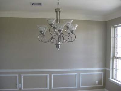
The chandelier in the dining room. Not my favorite chandelier of all time, but it's fine (though maybe a smidge too big for the room) and it will certainly work for the next few years until I can afford to replace it with something I love.

The master bathroom definitely went under some big changes this week as well. The Silestone counters are in as well as the under mount sinks. I really like the contrast between the light counters and the dark cabinets.

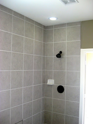
The tile in the shower came out pretty well, don't you think? Certainly looks a lot better now that it's grouted. There's a pretty ho-hum flush mount fixture currently in the bathroom that I'd love to replace with a small chandelier or Moravian star.

Here's a shot of the ceiling in the master bedroom. Don't you think a pewter metallic finish on the ceiling would be lovely here? The ceiling fan (alas) is going to have to go...I wonder if I can just replace the blades (in person they have a very strange plastic-y, tortoise-shell finish)? Does anyone know if you can purchase blades separately and swap them out?

The pendant lanterns in the entryway. I actually really like these but I'm thinking they should be lowered some more and sit closer to the top of the doorway (or at least below the clerestory windows). What do you think?

The window seat. Still my favorite spot in the house!

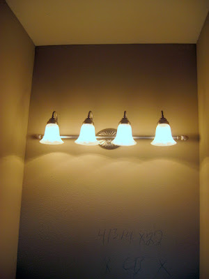
I saw the pendant lights that were going into all the bathrooms and nearly fainted. I hate them. I know, I know they don't look that bad here, but in person they look cheap and fussy and they completely don't match the antique bronze faucets and towel bars. So I'm going to replace them pronto. Suggestions on replacements are more than welcome!

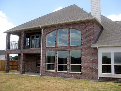
The landscaping in the backyard is just sod -- so we've definitely got a tabula rasa when it comes to setting up the backyard just how we like it. The wrought-iron railings for the upstairs' porch also went in last week. I also love how the back of the house is brick and not hardiplank (like our current house!). It's always nice when the back looks as good as the front, don't you think?

Based on their current progress, I'm expecting the house to be complete (or nearly so) by the time we get back from our vacation, so I think this will be the last "progress" post before the "after" pictures!

Pack It Up - Organizing For Kids On The Go

At last, Packtoozi! A simple, eco-friendly way to stock, pack and tote all those things you need when you're on the go with your kids.

The Packtoozi Organizational System was created with busy families in mind. It was designed to help keep you prepared, organized and save valuable time. This patent-pending system includes the Packtoozi Supply Headquarters, Packs, Tote and PacktoShop Note Pad.

The Packtoozi Supply Headquarters hangs over-the-door and is the in-home centralized storage area for everything your family needs on the go. It includes spacious pockets arranged in four color-coded and functionally labeled rows: PacktoEat, PacktoPlay, PacktoPotty and PacktoA-Z.

Like the Packtoozi Supply Headquarters, these four coordinating packs are color coded and functionally labeled: PacktoEat, PacktoPotty, PacktoPlay and PacktoA-Z. I especially love that these Packs are made in the USA with 100% organic cotton and contain no nasty chemicals or PVC that can be harmful to you and your kids.


Packs are stored conveniently in the Packtoozi Tote Bag or use side handles to grab individual packs for a quick outing or for a diaper change while you’re out.


This handy sticky note pad helps keep track of the supplies you need to restock the Supply Headquarters and Packtoozi Packs. Each row is color coded to coordinate with the rest of Packtoozi System. How handy is that!
Are you in need of one of these amazing organization systems? Packtoozi is offering all Simplified Bee readers a 10% discount. Please enter code: PacktoBee10

Voila! You are ready to go. Now don't forget the kids!


*all images from Packtoozi

I go both ways - the girlie edition

As I've mentioned before, I go both ways. Design wise, that is. I love super modern, clean, chic design. But I also love super feminine, traditional interiors as well. I kind of wish I was blogging from here right now:

From Elle Decor - Aerin Lauder Zinterhofer's home, photographed by Simon Upton.

Deliciously girly!

Peonies

I bought myself these GORGEOUS $6 peonies from Trader Joes - they bring a HUGE smile to my face every time I walk by the dining room.


Go out and buy yourself some flowers. They are the accessory that EVERY room needs.

Sunday, June 28, 2009

She's a Grand Ole Flag - July 4th Decor


"The basis of our political system is the right of the people to make and to alter their constitutions of government." ~ George Washington's Farewell Address, September 17, 1796

Americans spend Independence Day with family and friends, barbecuing and watching fireworks light up the night sky. Here are some designer interiors and patriotic party decorations in the spirit of July 4th.

Ashley Whittaker designed this darling red, white and blue scheme boy's bedroom. I recognized the white table and red chairs from Pottery Barn Kids - my girls have the same table with pink chairs. The white and red bedding is from Leontine Linens. Whittaker pulls this room together nicely with an American flag print by Maureen Andrews for Posh Papier.

In this lake house bedroom, designer Suzanne Kasler makes a strong patriotic statement with the American flag as the focal point. Love how she painted the ceiling blue.

This beautiful red, white and blue bedroom was designed by Meg Braff for her son. I love the geometric print in the Roman shade and bed skirt. The monogrammed red bed throw adds a nice personal element to the room.

Star-spangled family room! Designer Jason Bell kept this space fresh by painting the walls stark white. The armchair, upholstered in pale blue and navy chrysanthemum fabric from Osborne & Little and square woven coffee table help break up the navy elements. I just love those stylish and practical skirted ottomans in navy with nailhead detail.

This traditional red, white and blue living room found in Coastal Living is ideal for the seaside setting. I love the combination of red and blue striped furniture with coral-themed throw pillows to bring the outside in.


No 4th of July celebration is complete without festive decorations. Dress-up a gazebo or porch with box-pleated bunting and hanging star medallions as seen in Martha Stewart.


DIY and decorate your table by making firecracker pom-poms and table runners. Use ribbon to string stars inspired by colors and patterns in the American flag to make your own garland - both crafts from Martha Stewart.

Have a wonderful and safe July 4th!

Four freedoms: The first is freedom of speech and expression - everywhere in the world. The second is freedom of everyone to worship God in his own way - everywhere in the world. The third is freedom from want - everywhere in the world. The fourth is freedom from fear - anywhere in the world. ~ Franklin D. Roosevelt U.S. President

*images from Coastal Living, Martha Stewart and House Beautiful.

Friday, June 26, 2009

Dwell on Design - the Rundown

So I hope you read some of my tweets about the Dwell on Design event! It was a good time (anything with my good friend Michelle is a good time!) They had some interesting installations, some great accessories, some fabulous gardening idea, but I was underwhelmed by some of the items displayed. There wasn't a lot in the arena of new home architecture/design ideas, which is probably a sign of the economy more than anything else...

But, here is my rundown of my favorites:

Ligne Roset, a furniture company I have blogged about in the past, had this stunning installation right as you walked in...

It looked like interconnected, folded, felted wool shapes. In person, it was gorgeous, and the deep peacock blue color they used was fabulous. I've got their furniture catalog and I'm looking forward to spending my afternoon perusing it!


I blogged about these Log Bowls back in October - I was happy to see they look even prettier in person! That blue one - center, front - really wanted to come home with me.


And as I twittered earlier - Gardening is definitely the new black. Gardening isn't just for our moms anymore. I think with the economy in the pooper, people are going back to basics, like cooking, gardening... things that are fun, relaxing, and not super expensive... Here were some of my favorite gardening items:

This herb planter/table.

I'm not sure your herbs could be any fresher.


My FAVORITE overall booth was Woolly Pockets - these amazing breathable pots.

An entire woolly planter wall. The iPhone pic does not do it justice.


Another company (didn't see their name) had a wall of herb pots. Cute AND keeps the critters out.


A groovy tall pot.


Vitra also had a great display area, with their Vegetal chair (which was actually quite comfy!)

Their adorable kids chairs...


And elephants!
All in all, a great morning. I have some more product brochures to go through, so there will definitely be a part two on Monday...

I think I'll definitely be having a gardening weekend!

Tweets!

Stay tuned to my Tweets (which you can see over to the right) for my updates on the Dwell on Design event!

When Decorators Go Bad

My good friend Christina sent me a link to the real estate listing for this home here in Houston earlier this week and I couldn't resist sharing it with you all. If you'd like to take a look at the full listing, see HERE. Located on one of the nicest streets in town just minutes away from downtown, right near Rice University campus, this lovely 5,000sf. home is on the market for just under $2M and would be a dream home for just about every Houstonian I know.

That is until you go inside and get a load of the decor. There's a lot here in this house that's "on trend" (the gray and blue color palette, dark hardwood floors, limed furniture) and yet somehow I think most of these rooms miss the mark -- and some by quite a lot. It's a bit hard for me to put my finger on exactly why I think this house is so "off", but I think it just looks over designed, overwrought and, well, just a bit over. In light of the obvious time and money that went into decorating this house, I'd consider that a real tragedy.

In the living room, I actually quite like the sofa and chairs, though I wish the chairs were upholstered in a different fabric (a print would have been nice or even just a nice chocolate brown leather for some contrast to the light gray sofa, light gray walls, light gray curtains...). The zebra pelt draped across the coffee table really irks me though. I'll admit that I'm just not a fan of animal prints -- especially ones that look so freshly separated from the animal. But draping it across the coffee table? Ick. Generally though, this room just needs some more color (and I'm not talking anything too bold either -- just some deeper tones and/or patterns). I'd also swap out the white deer on the fireplace with a beautiful piece of art (with some color!) or a mirror over the fireplace.

Both Christina and I agreed that this dining room bordered on the bizarre. While I am reluctant to criticize the large painting (love the scale and the fact that it has some color), it just seems out of place in this very minimal room. The sky mural in the ceiling reminds me an awful lot of the Cheesecake Factory. I suspect a lot of pieces may actually have been removed from this room (and the house generally) to get it ready to show and I think this is a lesson in how decorating and selling your house don't always mix. By taking away the layers of accessories, lighting, rugs, etc. that would make these pieces work in this room, the end result looks like you ended up stopping midway through the design process. But then again, maybe this was the intended end result, in which case I can only say (in my sweetest Southern drawl) -- oh honey no!

The breakfast room looks like it got a fresh coat of white-wash just in time for the open house. Yawn. Shabby chic at its worst, in my book.

The layout of this kitchen looks great actually -- and it's got all the modern bells and whistles from the double oven to an island sink (and the copper farmhouse sink!) to a pot-filler over the stove. These modern conveniences also suggest this kitchen was recently redone. Too bad the limed cabinets make it look like a throwback to the '90s. Ah well, nothing a little white paint couldn't fix. ...Actually, now that I think about it, how great would this kitchen look if the only thing you did was repaint the cabinets white (well and redecorate the adjourning breakfast nook)?

This room is actually my favorite. The blue-gray walls are a lot deeper here than elsewhere, the furniture looks comfortable and the art on the walls is gorgeous. My only concern here is the furniture arrangement -- what precisely does one do in this room other than sit around and stare at other people? It's been labeled a library/study by the realtor but I don't see any bookshelves and that desk at the far end looks entirely too tiny to get any real work done. This room may be a victim of form over function. Also, and this is me nitpicking here, but I think the rug is too large for this space. I prefer 12-18" of exposed floor on all sides and this looks like less than 6".

This house has 5 bedrooms, four of which all look roughly the same, though the picture on top is of the master bedroom. I think the headboard in the master bedroom is spot-on, but I detest the animal hide on the floor (which reappears in just about every bedroom). The chandelier in the master also looks like it would be better suited to a dining room and I think I would've gone for something lighter and airier here, maybe clear or smoked glass. Generally though, like the public spaces in the house, the bedrooms just look far too cold and monochromatic for my taste. I think if you're going to stick with neutrals, warmer tones work better.

This must be the coldest, saddest nursery ever. I just hope the owners moved a lot out of here for the photographs because it's positively spartan.

The house also comes with a fully decked out "carriage house" -- presumably for your in-laws or your live-in nanny. All in all, I think it's really cute and it comes off a lot cozier (probably due to its smaller scale and lower, more intimate ceilings) than the main house, despite employing the same cool color palette and traditional-meets-shabby chic style.

So what do you think? Do you agree with me or do you like the look here?